 Submitted by carl.tulsa on
In this week’s Talk Nerdy to Me, the grand finale, we have not one but two graphs to show! They both relate to analyzing how everyone has been annotating during the semester, and so they provide an interesting window into how we engage with the texts as we read them.
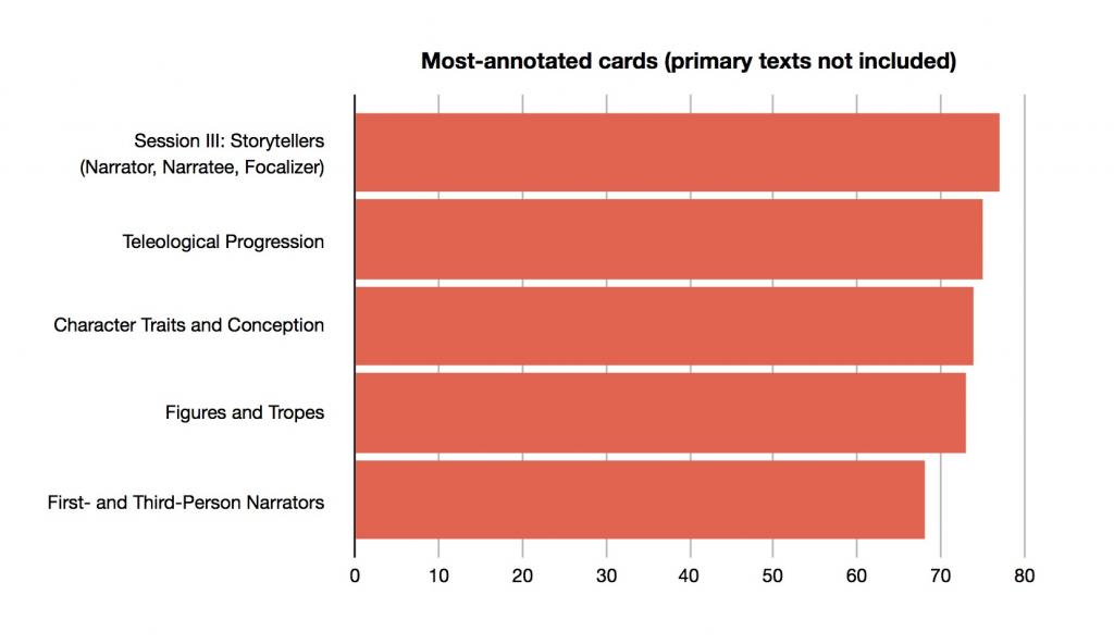
The first graph shows the five most annotated cards from the semester, not including primary texts. These are, in some sense, the cards all of you found to be most noteworthy (pun intended), but it doesn’t necessarily tell us why—that could be based on a variety of sometimes contradictory reasons, ranging from the difficulty of the card to the prevalence of useful quotes, for example. Of course, many reasons did contribute to the number of annotations on any individual card—it all depends on you, the reader!

However, this graph tells something useful about everyone: the annotation function was well used through the semester, and with four cards having over 70 individual annotations, it seems like a tool that was productive. While not every text you read in the future will have an annotation function built in, it remains one of the most important ways to engage with texts. Thankfully, this semester has been good practice for y’all!
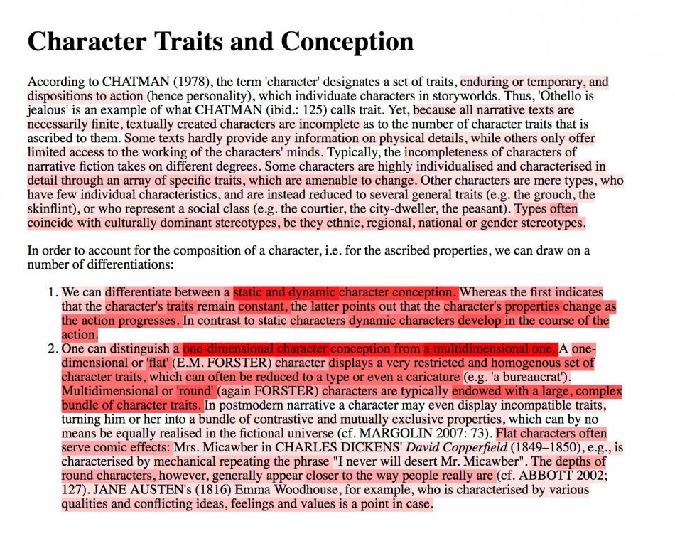
Our second graph is one of the coolest in Talk Nerdy to Me history. You’ve probably encountered it before, perhaps as a way to represent where the ball was in a football match or how the weather is changing—that’s right, it’s a heat map!

What this lets us see is the intensity (or lack thereof) of interaction with specific parts of a text. As is immediately clear, many more of you interacted with the two distinct ways of differentiating characters from one another than did with the sentence introducing the distinctions—for reasons as obvious as that difference! This trend is evident throughout the graph, as the redder parts consistently carry more weight than the whiter ones.
Of course, this form of graphing how the text was engaged with during the semester doesn’t tell us about anyone individually, but it lets us see the average amount of interactions with the specific pieces of the readings. But that information is still useful for representing engagement with the reading as a collective student body, and this lets us say with confidence that, as a group, you’re all good at picking out the important parts.
Finally, we have two interesting times to share with everyone: the earliest early bird logged on to SHRIMP at 4:02 am, and the latest night owl logged on at 3:34 am. That’s a special level of dedication!
Thanks so much for reading with us through the semester! We’ve really enjoyed creating and explaining these graphs, and hope y’all had just as much fun reading!